Redesigning WSG for Singapore’s Workforce

Introduction
Workforce Singapore (WSG), a statutory board under Singapore’s Ministry of Manpower, is pivotal in driving workforce development by empowering job seekers, employers, and career advisors through career planning, job matching, and upskilling programs. As Singapore navigates an evolving job market—shaped by technological advancements, post-COVID economic recovery, and the national SkillsFuture initiative for lifelong learning—WSG’s digital presence must reflect its role as a comprehensive career assistance platform. However, the existing WSG website faced significant challenges: users perceived it as a mere job portal, struggled with navigation, and were overwhelmed by cluttered content.
I led a UX redesign to transform the WSG website into an intuitive, user-centric resource. This case study details the journey from identifying user pain points through research to delivering impactful design solutions, leveraging insights from usability testing, focus groups, and collaborative design sprints. The revamp aimed to align the website with Singapore’s vision of a future-ready workforce.
Project Objectives
The redesign was guided by three primary objectives, informed by stakeholder input and user feedback:
- Increase Product Visibility: Spotlight key offerings like career coaching, upskilling programs, and employer support initiatives.
- Enhance User-Friendly Navigation: Streamline access to resources through intuitive, personalised design.
Reposition WSG as a Career Assistance Platform: Shift the perception from a job portal to a holistic career development tool, as encapsulated in the guiding question:
"How might we guide job seekers to view WSG not just as a job hub, but as a career development tool, and help them find the most relevant resources for their specific career goals?"
These goals addressed the diverse needs of WSG’s audience while supporting broader national workforce transformation efforts.
Research Phase
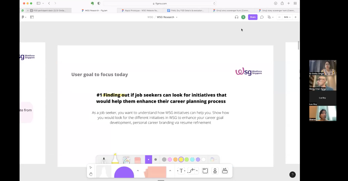
To inform the redesign, we conducted a multi-method research approach to uncover user needs, behaviors, and frustrations. This involved a website scan, focus group discussions (FGDs), in-depth interviews, and journey mapping, targeting three key user groups: job seekers, employers (HR), and career advisors.
Research Methods
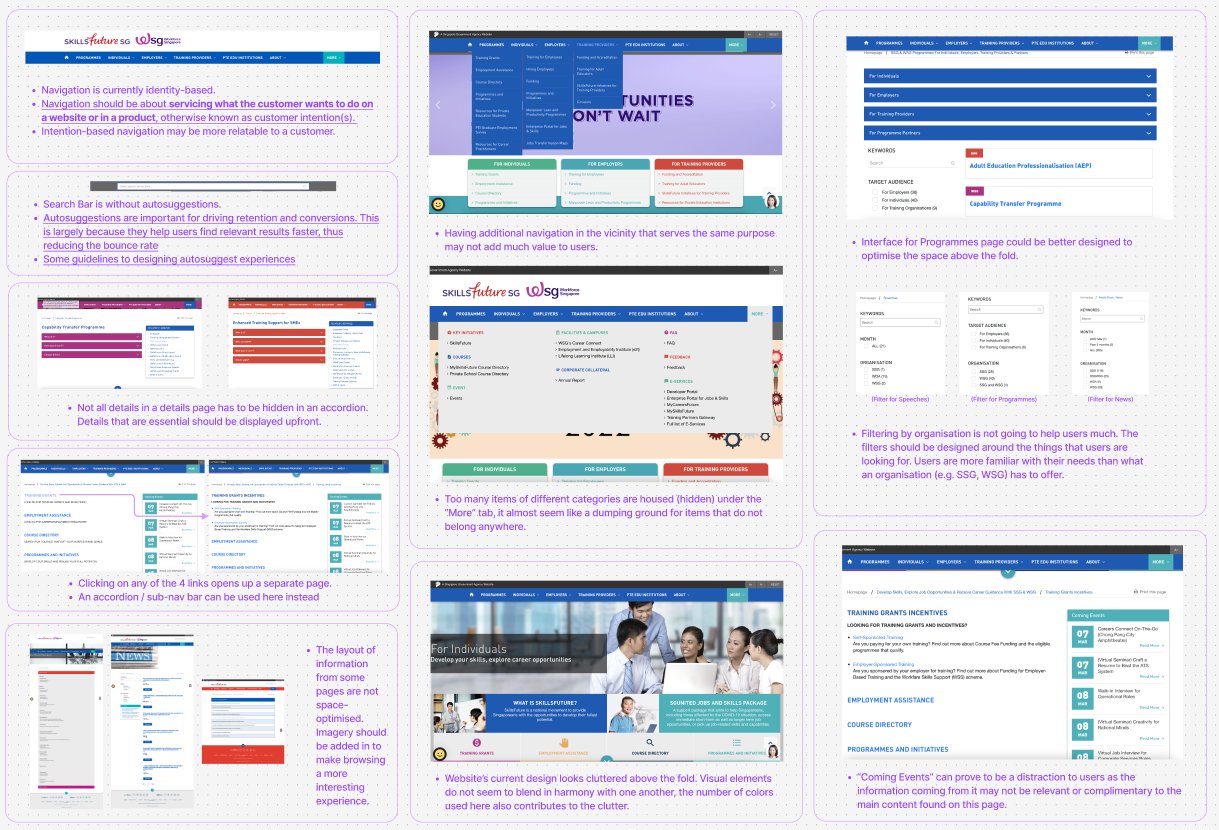
Website Scan: An initial heuristic evaluation identified usability issues like cluttered layouts and poor content hierarchy.
Focus Group Discussions (FGDs): Three sessions were held with 4 job seekers, 2 HR professionals, and 3 career advisors to explore mental models around job seeking, manpower issues, and perceptions of WSG. Participants scored the current site and a draft prototype.
In-Depth Interviews: 32 interviews with job seekers validated FGD findings, diving deeper into their career planning attitudes.
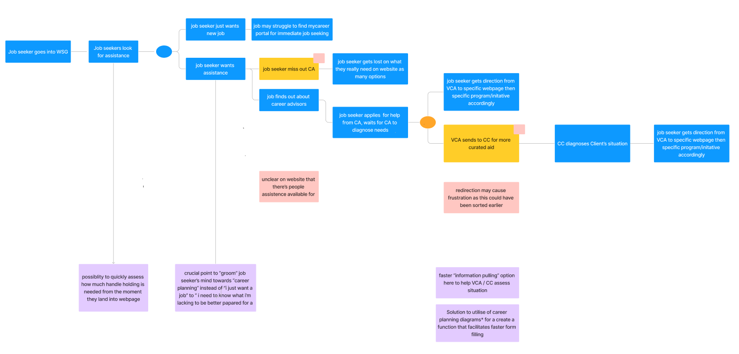
Affinity Mapping and Journey Mapping: Qualitative data was synthesised into themes, with journey maps visualising user experiences (e.g., job seekers’ “tunnel vision” focus on job hunting).
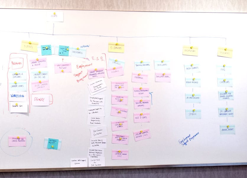
Co-creation of Information Architecture (IA): We conducted card sorting exercises with 10 participants to understand how they would naturally organise WSG's content. Both open and closed card sorting revealed that users preferred task-based groupings (e.g., "Find a Job," "Develop Skills") over audience-based categories. This insight helped us restructure the navigation to align with user mental models and create clearer pathways to information.
Key Insights
Job Seekers
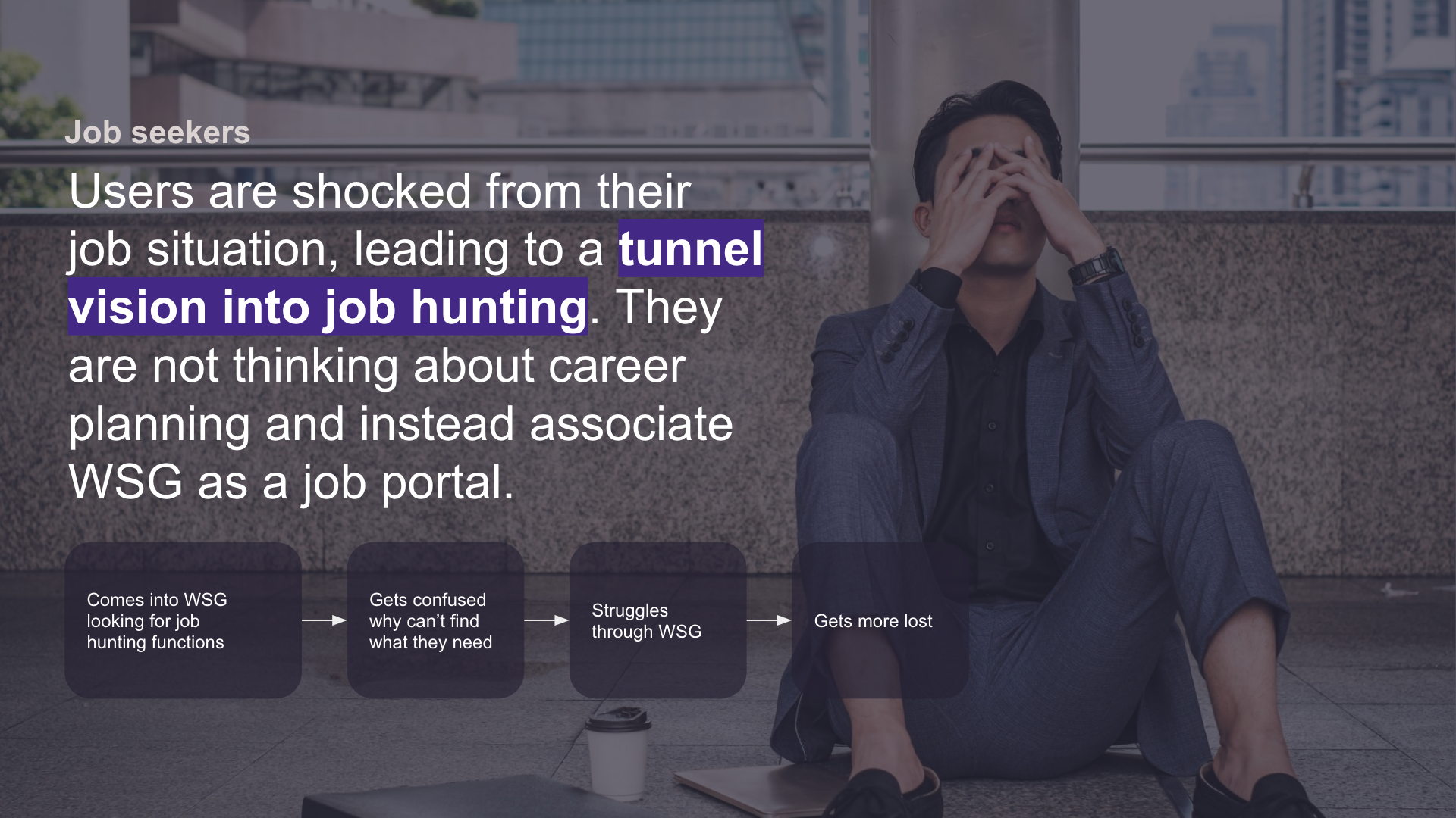
- Tunnel Vision: Job seekers approached WSG with an urgent need—“I need a job”—expecting a job portal like MyCareersFuture (MCF). This narrow focus led them to overlook career planning resources, associating WSG solely with job hunting (Image 3: "Job seekers are shocked from their job situation, leading to a tunnel vision into job hunting").
- Resistance to Planning: Rebuilding skillsets felt daunting, with many resistant to change until job hunting yielded poor results (Image 6: "Realising that one needs to stop back & re-build… feels uncomfortable").
- Misconception: The website’s career planning focus wasn’t obvious, causing disappointment and disengagement (Image 6: "Job seekers don’t naturally assume that WSG is a planning focused website").
Employers (HR)
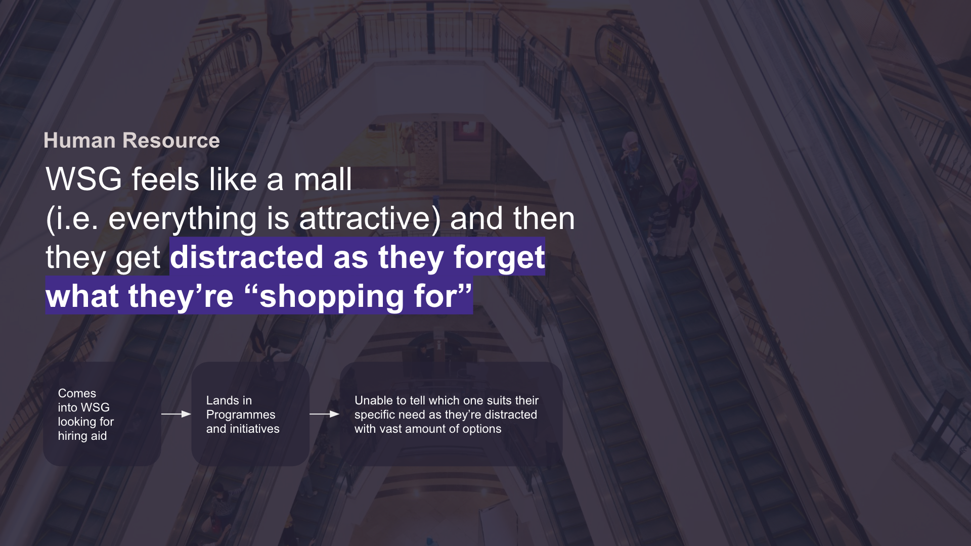
- Information Overload: HR professionals found the site overwhelming, likened to a “mall” where they forgot their intent (Image 5: "WSG feels like a mall… they get distracted"). Navigating programs was challenging due to the vast, unfiltered options.
- Specific Needs: Employers struggled to identify relevant hiring aids amidst the clutter (Image 5 flowchart: "Unable to tell which one suits their specific need").
Career Advisors
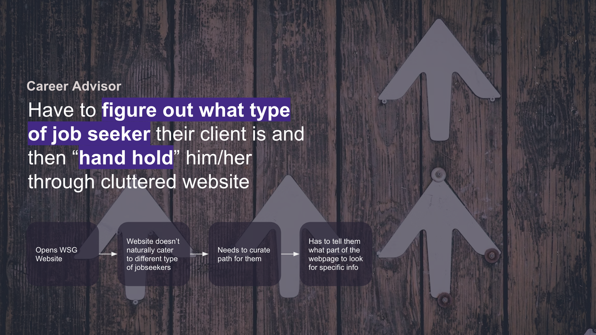
- Non-Intuitive Design: Advisors noted the lack of curated guidance, especially for diverse job seeker types—urgent seekers, career explorers, transitioners, and goal-driven individuals.
- Guidance Role: Advisors had to “hand hold” clients through the cluttered site, highlighting the need for clearer pathways.
Problem Statement
The existing WSG website failed to align with user mental models: job seekers saw it as a job portal, employers were overwhelmed by unfiltered content, and advisors struggled to guide clients through a cluttered interface. The challenge was to redesign it into a career assistance platform that clarified its purpose, streamlined information, and personalised experiences for its diverse audience.
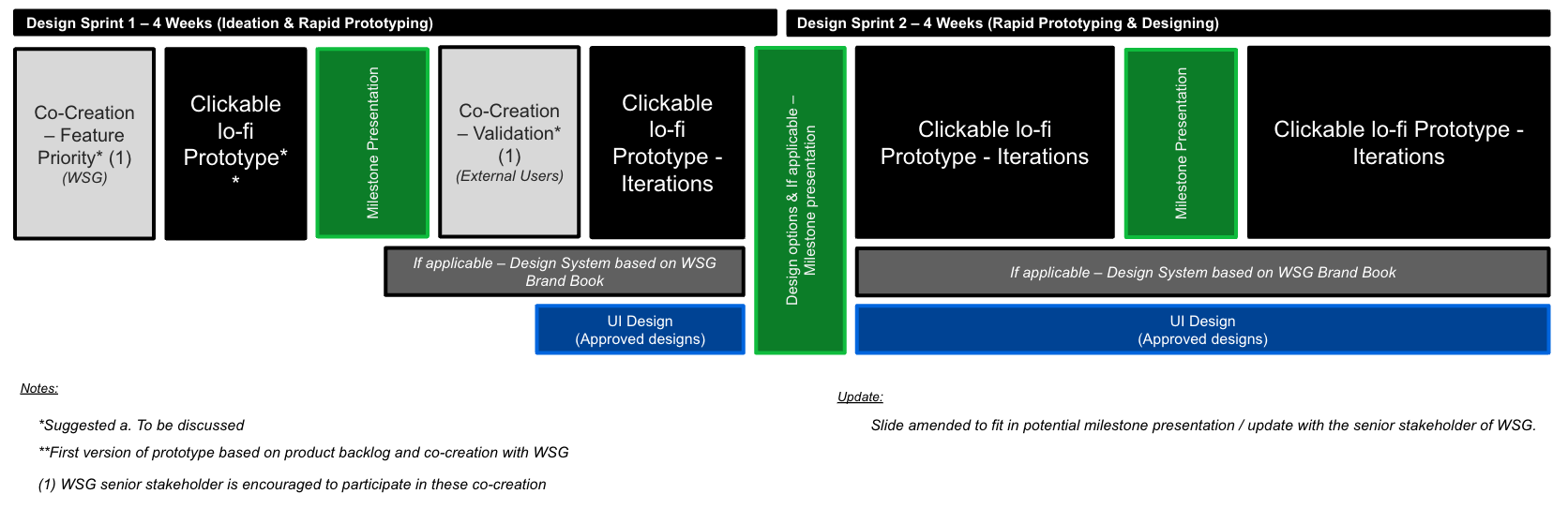
Design Phase
The design process was iterative, involving two sprints with mockups refined through co-creation with WSG stakeholders and usability testing. Our goal was to create a visually compelling, functional design that addressed the research insights.
Design Exploration
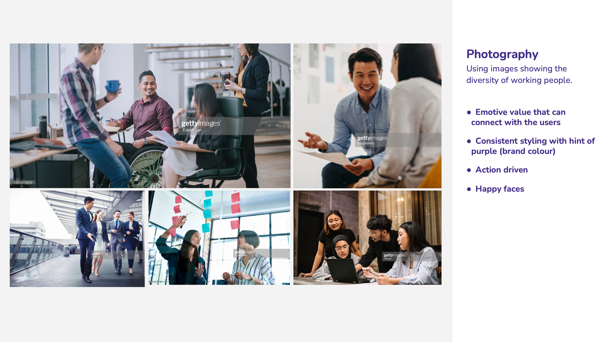
Authentic Representation: We carefully selected images that depict a diverse, modern workforce—ranging from young professionals to mature workers and individuals with varying abilities.
- Emotive Value: Each photo captures positive interactions, from brainstorming sessions to supportive one-on-one meetings. This approach resonates with users who are seeking community and guidance.
- Purple Accents: Subtle use of brand colour in backgrounds or accessories ties the images back to WSG’s identity, maintaining consistency.
By reflecting Singapore’s multicultural workforce, the photography supports WSG’s mission to be inclusive and relevant to all job seekers.
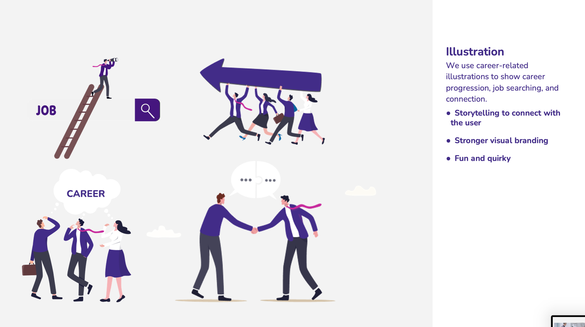
Career-Focused Imagery: Our custom illustrations depict scenarios like job searching, career progression, and networking.
- Storytelling to Connect: Rather than using generic clip art, we created playful but meaningful visuals that illustrate key user scenarios—e.g., someone climbing a ladder labeled “JOB,” or groups collaborating toward a shared goal.
- Stronger Visual Branding: By weaving WSG’s purple palette into each illustration, the artwork became an extension of the brand identity, creating a unified look across the site.
These illustrations humanise the content, helping users quickly identify the section that’s most relevant to them (e.g., “Career Guidance” vs. “Employer Services”).
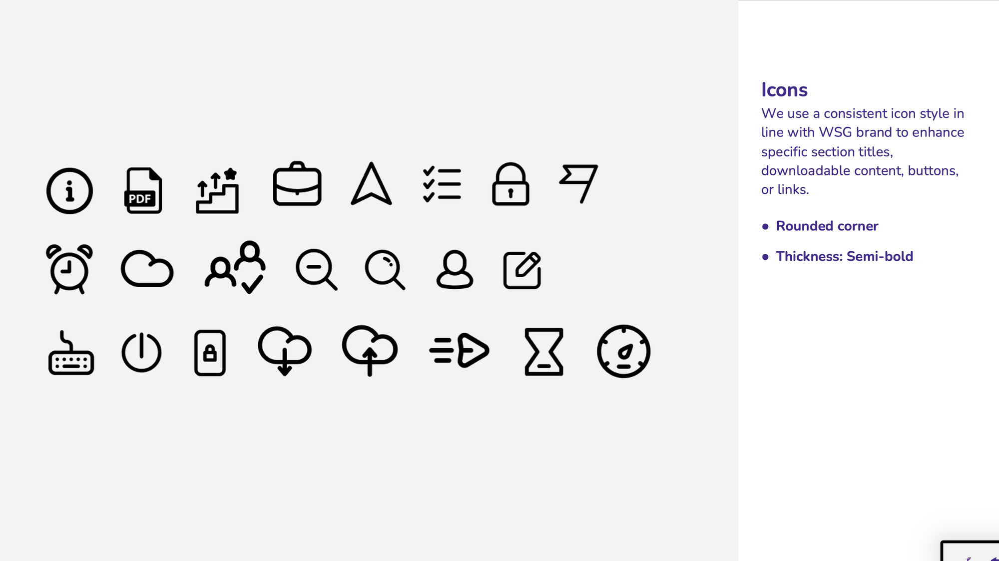
Consistent Visual Language: We choose a icon set that aligns with WSG’s brand style—clean lines, semi-bold strokes, and simple shapes.
- Clarity & Function: Each icon (e.g., “PDF download,” “Employer,” “Career Path,” “Lock” for secure content) communicates purpose at a glance.
- Brand Continuity: Purple accents tie the icons back to the overall colour scheme, ensuring a cohesive user journey across all pages.
Icons help break up text-heavy sections and guide users to essential actions (such as downloading a factsheet or exploring a job search tool).
Hero Section: “Let Us Understand You Better”
During our research, one of the most pressing issues was the confusion around WSG’s role. Users repeatedly asked, “Is WSG just a job portal or a full-fledged career assistance platform?” This misunderstanding led to frustration and high bounce rates. Employers and job seekers alike struggled to find the right programs, while many were unaware of the full suite of services WSG offers.
The redesigned homepage aims to dispel these misconceptions by immediately showcasing WSG’s diverse offerings and guiding users toward personalised solutions.
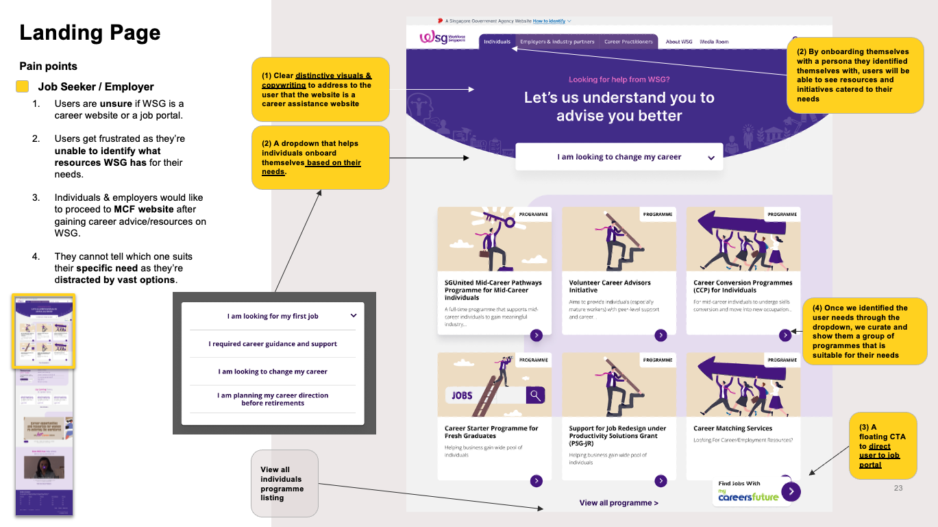
- Clear Positioning: The bold headline, “Let us understand you to advise you better,” signals WSG’s consultative and supportive role. Instead of a simple “search jobs” banner, the user sees a more holistic invitation to explore career development pathways.
- Immediate Pathways: Quick-action buttons—such as “I am looking for a job,” “I need guidance or upskill,” “I am an employer,” etc.—help different user groups self-identify. This reduces the cognitive load of navigating through generic menus, ensuring visitors land on the most relevant resources faster.
Why This Matters: By allowing users to identify themselves upfront, the homepage sets a personalised tone. This is critical for job seekers with “tunnel vision,” as it gently nudges them to see beyond immediate job listings and consider other career assistance options (e.g., workshops, career coaching).
At-a-Glance Information
Before diving into full details, users often want a quick overview. The Programme Card format provides:
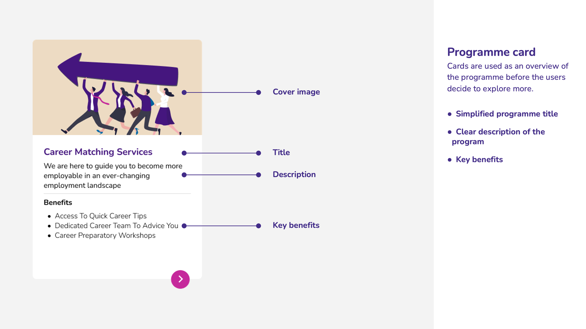
- Cover Image & Title: Immediately communicates the program’s focus (e.g., “Career Matching Services”).
- Short Description & Key Benefits: Summarises what the user stands to gain—like “Quick Career Tips” or “Career Preparatory Workshops.”
- Call-to-Action Arrow: A simple arrow icon or “Learn More” button entices further exploration.
These cards align with user feedback requesting clearer, concise previews of each initiative.
Deep Dive Without Overwhelm:
The Programme Detail Page offers comprehensive information—eligibility, benefits, downloadable resources—while maintaining an uncluttered layout.
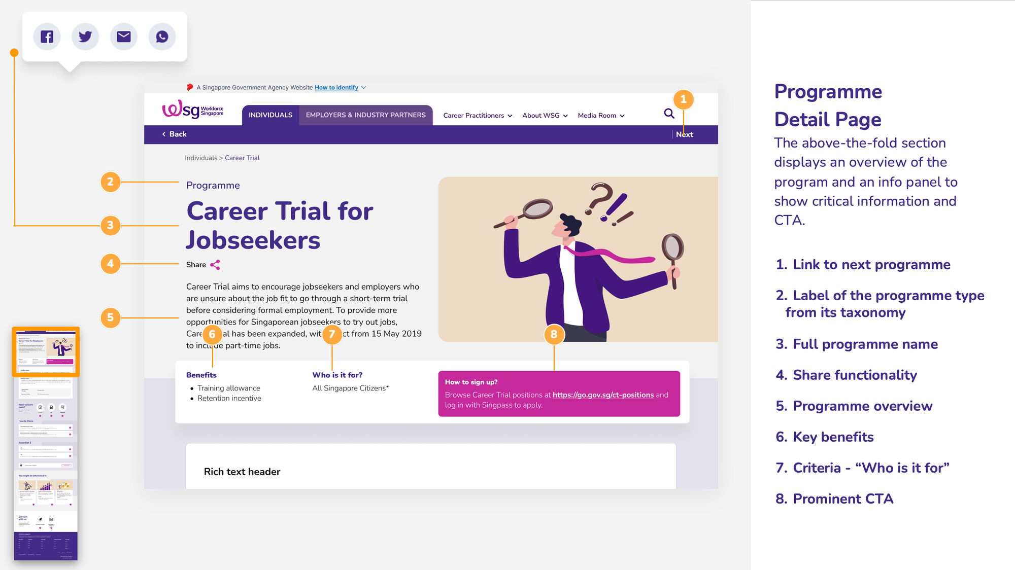
Above-the-Fold Clarity:
- Program Name & Tagline: Users know exactly which program they’re viewing.
- Info Panel: Key facts (e.g., “Training Allowance,” “Funding Options”) are displayed in an easily scannable format.
Rich Text Header & Key Criteria:
Summarises the program’s essence before users scroll, catering to those who want quick details.
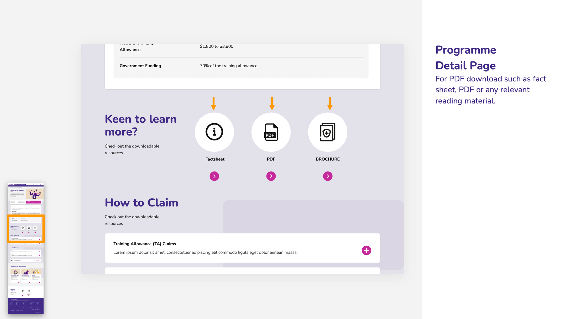
Downloadable Resources Section:
Icons for PDF, Factsheets, or Brochures are clearly marked, addressing the employer need for official documentation and the job seeker desire for reference materials.
By segmenting information into logical sections (overview, criteria, how to claim, downloads), the page caters to users with different levels of urgency—whether they need a fast answer or a deep dive.
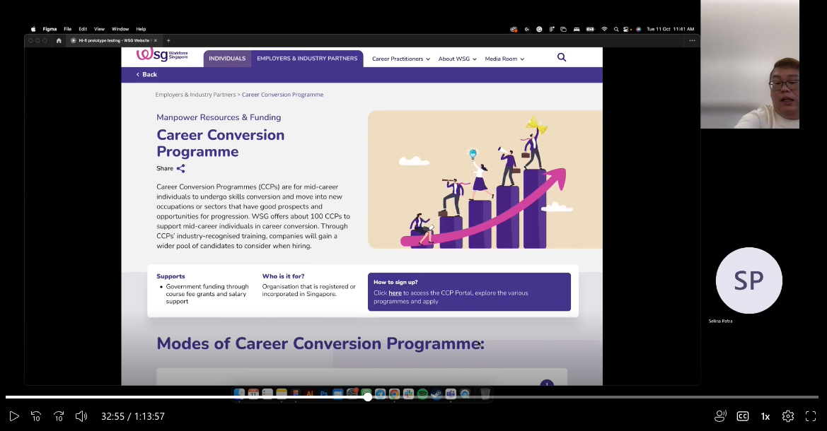
Usability Testing and Iterations
The clickable prototype was tested with job seekers, employers, and advisors. Key findings:
- Positive Feedback: The MCF button and segmented content improved navigation (average usability score: 8.75/10 vs. 5/10 for the current site).
- Suggestions: Reduce image sizes and add career fair visibility
- Iterations: Scaled down images, added an “Events & Fairs” section on the homepage, and refined filters for employers.
Conclusion
The WSG website revamp transformed a cluttered platform into a compelling career assistance hub. By leveraging research insights—such as job seekers’ tunnel vision and employers’ overwhelm—and translating them into mockups like the personalised dashboard and filtered employer pages, we created an authentic solution. This design not only meets user needs but also supports Singapore’s vision of a future-ready workforce, setting a benchmark for government digital services.