An Analytical Approach to Driving Informed UX Decisions
This case study explores how data analytics enhanced UX design through two key methodologies: a trackable dipstick survey for understanding user sentiment and journey patterns, and Tree Testing for quantitative validation of Information Architecture (IA) decisions.
Our research findings provided evidence to support our design decisions and created a scalable framework for future content organization.
While this project incorporated various qualitative methods including user interviews and focus groups, this case study specifically examines how data analytics informed the design decisions.
Project background
The Singapore Food Agency (SFA), Singapore's national food safety authority, maintains a informative website serving both the public and food business operators. The website houses critical information on food safety standards, regulatory requirements and licencing procedures - essential resources for food businesses across retail, farming and manufacturing sectors.
These resources are vital since they directly impact business compliance and operational success.
Our project aims to analyse user interaction patterns, identify pain points and implement design improvements to enhance the overall user experience of the platform.
My Role
As the UX Lead, I oversaw the entire research and design process—everything from setting objectives to integrating findings into final design solutions. I collaborated with internal teams such as Analytics, Licensing, and Content Owners to plan how we’d run our dipstick survey and eventually follow up with tree testing. I also facilitated workshops, rallied stakeholders around user insights, and ensured our final IA accounted for real-world usage patterns.
Dipstick survey (GA4 integration)
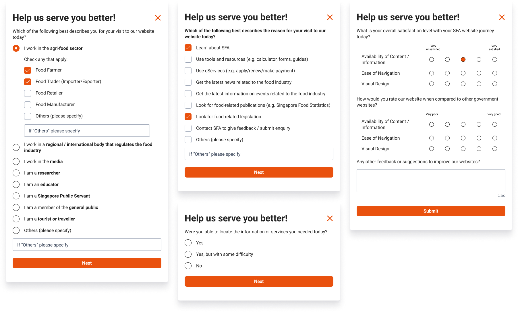
When we ran our dipstick survey, we knew Google Analytics (GA4) alone wasn’t enough for a holistic view of user sentiment and motivations. GA4 can track page visits and user flows, but it doesn’t capture which specific user segment is doing what, or how they actually feel about the experience. That’s why we introduced a brief exit survey.
Each session was tagged with a unique ID, so we could link the user’s behaviour (for example, which pages they visited) with their survey feedback.
Of course, one of the key considerations was sample size. According to HubSpot’s explanation on survey sampling (see: blog.hubspot.com/service/survey-sample-sizes), a 95% confidence level is often the goal if you want to be pretty sure your results speak for the wider population. Along with that, we looked at the margin of error—ideally around ±5%.
In practical terms, though, we had to balance these statistical ideals with our timeline (two weeks) and the cost of getting enough responses. We were also aware that this dipstick survey wasn’t our only validation route; it simply gave us a convenient snapshot of sentiment and behavioural patterns.
Still, using these guidelines helped us set a realistic response target. We felt confident that with careful planning, two weeks of data collection would yield enough responses to notice broad trends.
We wound up with 362 responses with Members of Public accounting for 33% and Food Business Operators for 23%, a decent sample for our short survey window.
What we did
- Tagged Each Session: I worked closely with the Analytics team to hammer out the GA4 integration. We decided on a system where each session got a unique ID. That way, once the user opted into our survey, we could link their in-page actions with their exit-poll answers.
- Asked Key Questions: In our brief exit poll, we included why they visited the website (e.g., to find legislation, look up news, or use eServices), whether they found what they needed, and how they felt about the experience.
- Combined Data Points: By matching GA4 session data with user responses, we could see exactly which pages challenged people, which tasks they found straightforward, and how they rated the website’s information architecture.
Result and Insights
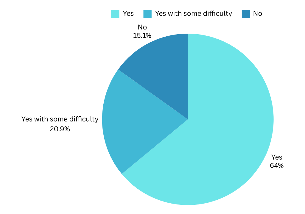
Task Completion: About 64% of participants said they found what they needed pretty easily, but 21% faced some hurdles and 15% couldn’t complete their task at all.
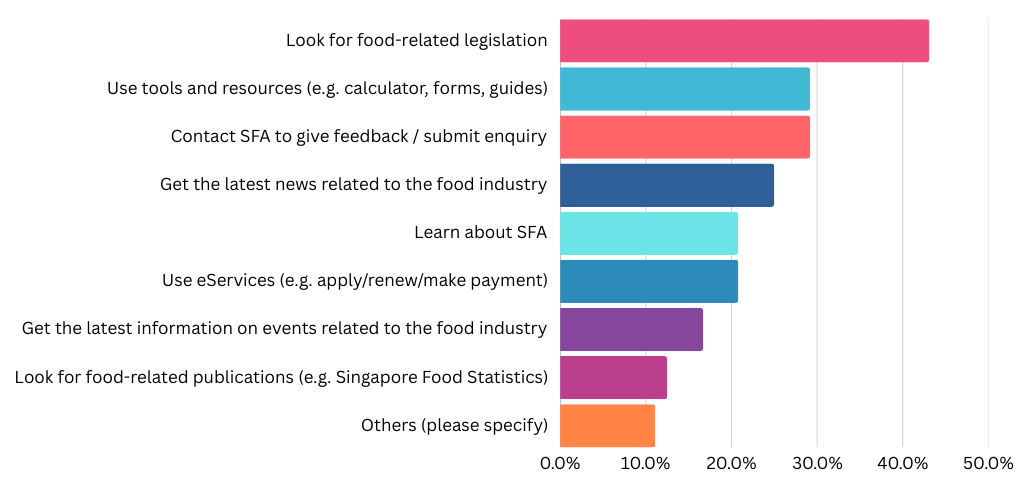
Common Goals: The top reasons for visiting included looking up food-related legislation, reading the latest industry news, and simply learning more about SFA’s role.
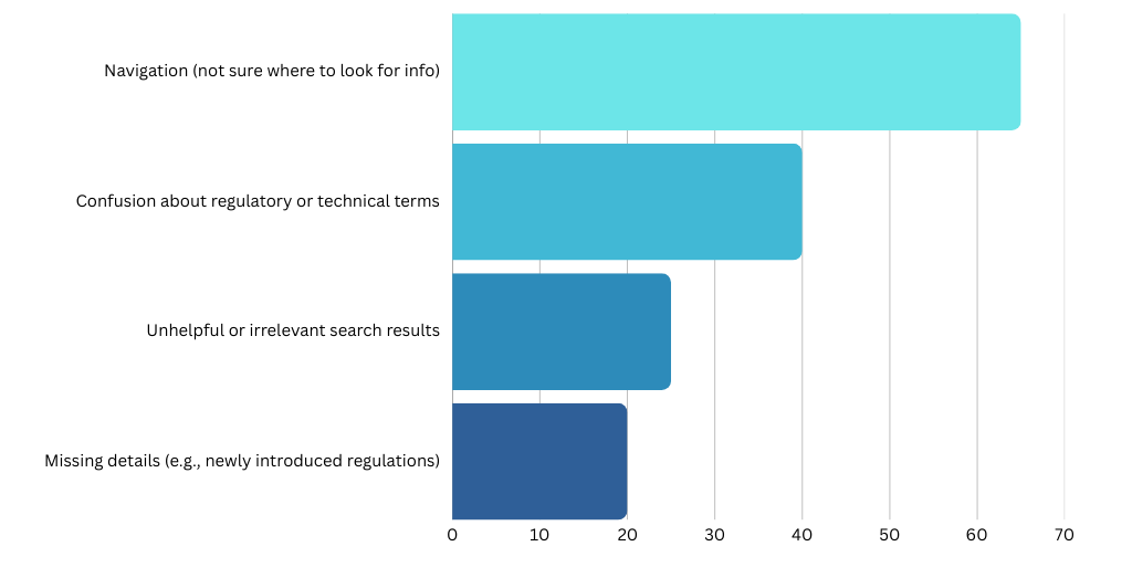
Key Pain Points: Navigation stood out as the biggest challenge. A number of users also flagged confusion about regulatory terms, unhelpful search results, or missing details on specific topics (like certain licensing steps or newly introduced regulations).
User Segments: Each food-business segment—Manufacturers, Traders, Retailers, and Farmers—reported distinct challenges, but all consistently highlighted navigation issues. Farmers, in particular, stood out with the highest rate (80%) of “Difficult to Navigate,” suggesting they struggle most with finding relevant details on the site.
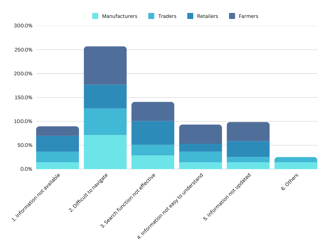
Retailers had the highest mention of “Search Function Not Effective” (50%), indicating they rely heavily on quick searches to confirm license conditions or guidelines. Meanwhile, Manufacturers and Traders often mentioned that “Information Was Not Available” or “Not Updated” in ways that address more advanced regulatory concerns (like specific labeling rules or import procedures).
In essence, these data points show how FBO users, across all segments, require more in-depth and up-to-date content—especially on compliance and licensing. The chart also confirms that if the site’s IA and search tools aren’t clear, each segment struggles in its own unique way when hunting for details.
This dipstick approach gave us fresh, quantitative data to validate known pain points (like site navigation) and uncover blind spots—particularly around complex licensing requirements. It also confirmed that user sentiment can swing dramatically based on whether they quickly locate key information (like “Conditions for Food Import”) or have to jump around searching. Going forward, these insights will help us refine the site’s Information Architecture, bolster content clarity, and prioritise improvements to the search function.
Tree testing
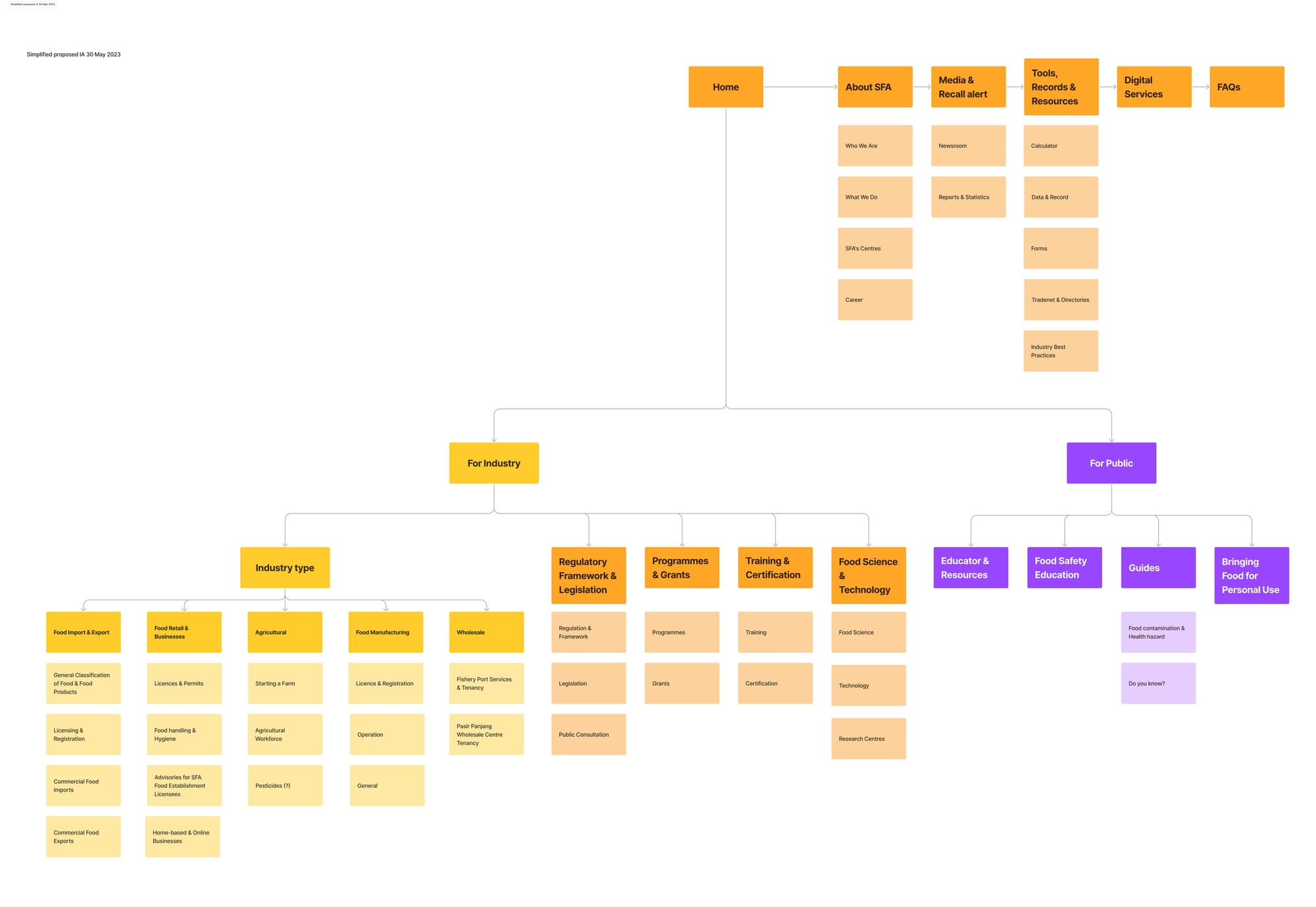
When we first did a focus group discussions with content owners, everyone agreed: the way the content owners grouped and labelled topics was not carefully planned. Over the years, whenever new pages came up, they just got dumped under a catch-all category called “Food Information.” It was the simple solution at the time, but it created a big mess for users trying to find things.
Reworking the site’s Information Architecture (IA) turned out to be a big job. We had to sort years of content, consult multiple teams, and go through several rounds of refinements. Once we had a halfway-decent structure, we put it through tree testing to make sure the new layout made sense to real users.
What We Did
- Drafted a New IA
We started by grouping key topics (e.g., imports, licensing, inspections, public health) into broad categories like “For Industry” and “For Public.” Then, we broke these down further into subcategories like “Food Retail & Businesses,” “Food Import & Export,” and so on.
- Ran Remote Tree Testing
We used an online platform (Maze) to test how quickly and accurately participants could locate specific bits of information. Tasks ranged from “Where do I find labelling guidelines for prepacked produce?” to “How do I check if I can bring roast goose into Singapore?”
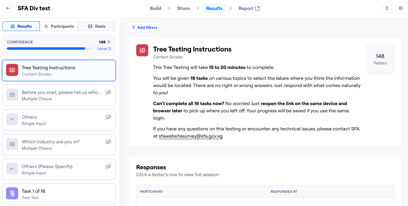
- Recruited Over 100 Participants
We aimed for a balanced mix of food business operators (retailers, manufacturers, traders, farmers) and general public. We wanted feedback from people with varying degrees of familiarity with the site. - Measured Success & Directness We tracked whether participants found the correct label on their first try and if they had to backtrack at any point. High “directness” meant our category labels made sense right away. Low directness warned us that a label was confusing, or the content was hidden in the wrong place.These two metrics gauge how easily participants located the right spot:
- Success Rate is how many people found the right page, even if they took a few detours.
- Directness (or “Happy Path”) shows how many got there on the first try without backtracking.
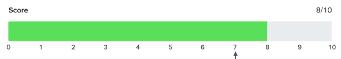
We combine both scores on a 1–10 scale. Anything under 7 usually means some labels or paths need fixing.
Result and Insights
A total of 16 tasks were administered during our tree test, each yielding a rich set of data on user navigation and decision-making. We exported raw results from Maze and plugged them into Power BI, enabling us to visually map out where participants clicked first, which paths they commonly took, and where they encountered detours. This data-driven approach helped us quickly identify which IA labels and routes worked well, and where we still needed to refine naming or cross-links to guide users more efficiently.
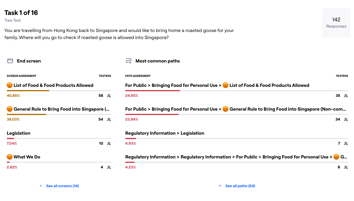
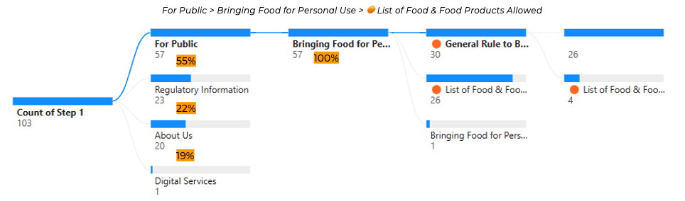
- High Success, But Confusion in Labels Many participants ultimately found the correct location, but some labels caused detours. For instance, people seeking “Bringing Food for Personal Use” often hovered over “Regulatory Information” or “Conditions for Food Import” first. That told us we needed cross-links and possibly clearer wording (like “Can I Bring Food from Overseas?”).
- Overlapping Categories We saw some users jump between “For Industry” and “Regulatory Information.” This indicated that our structural separation wasn’t always clear. We ended up duplicating a few key topics under both sections so users could find them no matter their mental model.
- Clear Patterns of First-Click We noticed strong first-click success on tasks like “Where can I see a restaurant’s food safety track record?” The label “Tools & Resources” was less obvious to many testers, so we proposed placing “Track Records” under “For Public” as well.
- Low Directness for Niche Topics Tasks about niche or newer content—like “Careers in Agri-food”—proved trickier. Participants were sometimes unsure if it should be under “Start a Farm” or “Funding & Grants.” This told us we should either rename or better explain certain subcategories.
Our tree testing validated parts of the new IA but also revealed some blind spots. We learned that certain topics (labelling rules, import conditions, personal use guidelines) need more than one path. Next steps involve renaming a few categories, adding cross-links, and re-testing any high-confusion areas.
All in all, tree testing was a big help. It took our best-guess IA and let real users stress-test it. We’ve since tweaked our labels and grouping logic based on their feedback. In the end, it’s another milestone in creating a clearer, more logical website—one that keeps pace with all the new content while staying user-friendly.
Closing Thoughts
By blending dipstick survey data with tree testing, we tapped both wide-scale user sentiment and deeper structural validation. This two-pronged analytics-driven approach let us move from “We think these labels are poor” to “We know exactly where and why people get stuck.” In the end, it also made internal buy-in easier: armed with hard data, we could clearly justify the merges, renames, and re-labelling needed to accommodate a growing and increasingly complex set of pages.
For me personally, leading this project was an eye-opening experience in balancing what different divisions believe is most important with what actual users need in real scenarios. I look forward to seeing how these insights carry forward as the site evolves—ensuring that we keep refining the IA as SFA expands its offerings in future.